Workflow
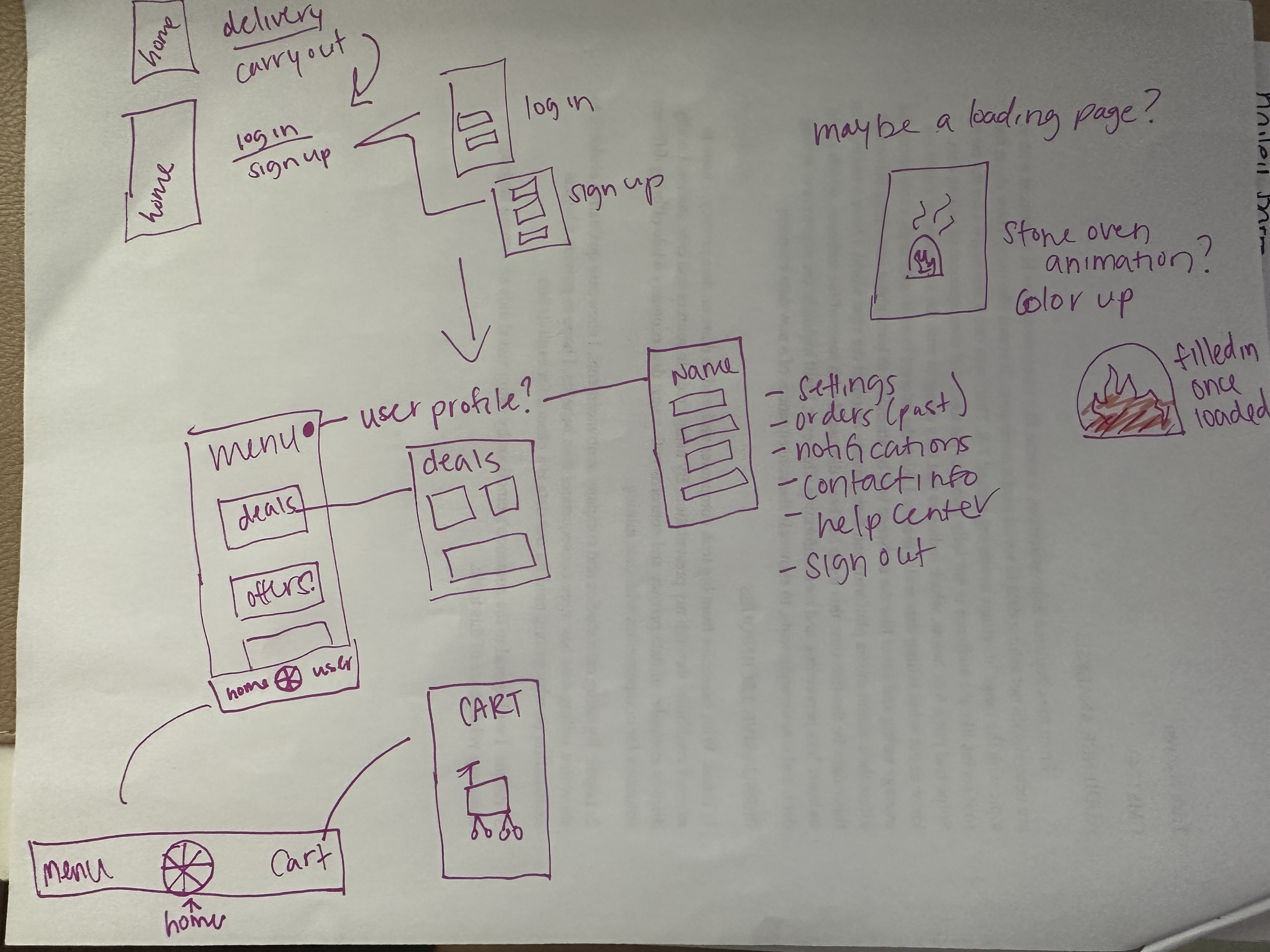
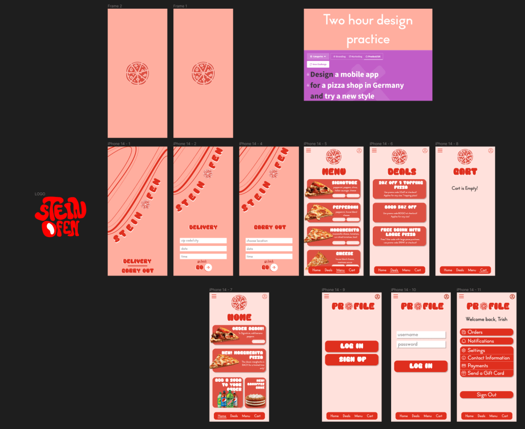
Before getting on Figma, I drew out a messy mockup of how I wanted the design to interact. I listed out some general uses for the app and added content for the store. Some things that I have never used before were an animated loading screen and logo creation.
I wanted to use bright colors, since I tend to go for neutral palettes in my designs. I wanted it to be more fun and playful, so I used rounded, bubble like lettering. The shading with each product description was also new, but I tend to use it more often with other designs–it adds such a nice layered effect that seems more cohesive than a flat overlay.
The prototype includes the landing page with delivery or carry out options. If you aren’t signed in, it will prompt you to sign in or sign up. The home page is an overview of deals and popular items. It could also have a reorder button, if you want the same thing as before. The menu includes a menu, deals, and cart tabs for easy navigation. The profile is on the top right corner which displays user information and settings options.
Review
I stopped designing around an hour and 45 minutes to create a logo. I relied heavily on Figma plugins for art, but I wanted to get more involved with this design. Since I used playful line work with the arcs and swoopy lines, I wanted a hand drawn logo to keep that playfulness and ass a bit of character to the shop name. Stein Ofen means stone oven in German, so if I were to go back a redesign the logo, I would add brick texture around or in the words. This project was definitely a fun one.
You can view this design on my Figma, linked on the Home page.
