Big Orange Tix: Case Study
Big Orange Tix was an unsolicited redesign for the TicketReturn website used at the University of Tennessee. This was meant to improve visibility and navigation with the current ticketing site, eliminating confusion when it comes to buying and viewing sporting event tickets.

Problem Diagnosis
To investigate user experiences with the platform, my team and I conducted many interviews with the main users and tracked their usage through a series of contextual inquiries.
Main Users: UTK Students
The main users of this website have one goal in mind: buy a sporting event ticket. My team and I hit campus to see who we could provide feedback on their experiences. I had talked to students with tickets to the upcoming football game, and those who were planning to buy tickets, both repeat customers or first time users. Other primary users included UTK staff and avid fans of SEC football, but the main users of the TicketReturn site had been students.
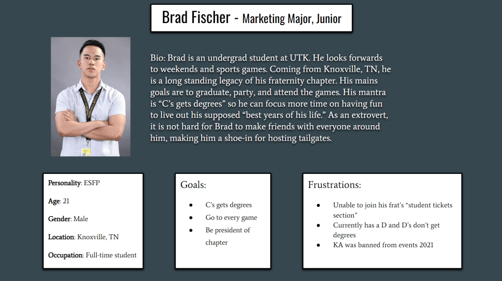
We had chosen to make a few user personas that reflect the common demographics that use the ticketing site.
Main Objective
We wanted to target the most inefficient aspects of the website in order to relieve pain points that students encounter, especially around their limited time frame of retrieving a game ticket.
After determining that navigation and tracking were large concerns for the interface, we set to asking questions on users thoughts of their buying processes.
Some questions:
- What about the design do you think could be better about this website? Is there anything about it that is bothersome?
- Is it easy to track your expenses on this website? Account information, tickets bought, ability to refund tickets, etc.
- How easy is it to find this website? How many webpages do you have to go through to be able to purchase a game ticket? Do you think this site is easily accessible and understandable?
- Are there any concerns with this particular website? Is it reliable for ticket exchanges or do you use an alternate route?
Work Activity Affinity Diagram
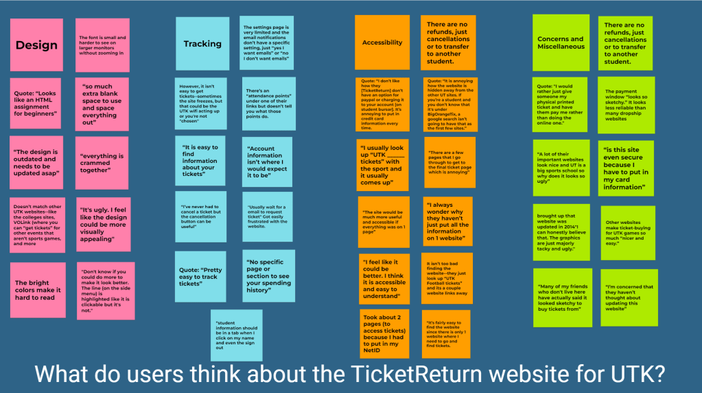
Going around campus, each of us brought up questions when game ticket buying periods started. We compiled the responses to a card-sorted diagram to visualize main pain points for the website.
This inquiry was not based on internal response. We also refrained from asking older students, due to the fact that they have had a substantial amount of time learning the interface.
Prototyping Processes


Choosing to highlight main concerns of the website, we set to go through design aspects that could help the ticket buying process for students at UTK.
Redirecting BigOrangeTix to a UTK affiliated website creates continuity within the web of UTK events. This eliminates the confusion users have when reaching the website itself and decreases the amount of clicks needed to get to the destination.
Improvements
Improving navigation:
We had the website stem from the main UTK Sports site for easy access. We added a more consolidated sidebar to compartmentalize actions through the site.
Improving visibility:
We used the UTK official color palette to make sure the text is easily visible and accessible. The table of events is more clear to see and any buttons leading to ticket purchases were enlarged.
Improving actionability:
How can we make the check out page more secure? We have a credit card entry redesign that makes it look more secure and enlarged the services that UTK uses for secure purchases. We recommend integrating PayPal or a similar service to alleviate suspicion.
Next Steps
As this was a class project, we have not seen any feedback from users themselves. However, we have peer reviews that highlight usability concerns about the first prototype. As the class ended for the semester, I have taken the feedback to redesign the first prototypes given.
Aims:
- The mobile version prototype should be even easier to navigate given its smaller interface. With interactive design, viewing events and pictures would be easier.
- There should be higher contrast for visibility and accessibility.
- Emphasize log in page for a faster customizable experience.
